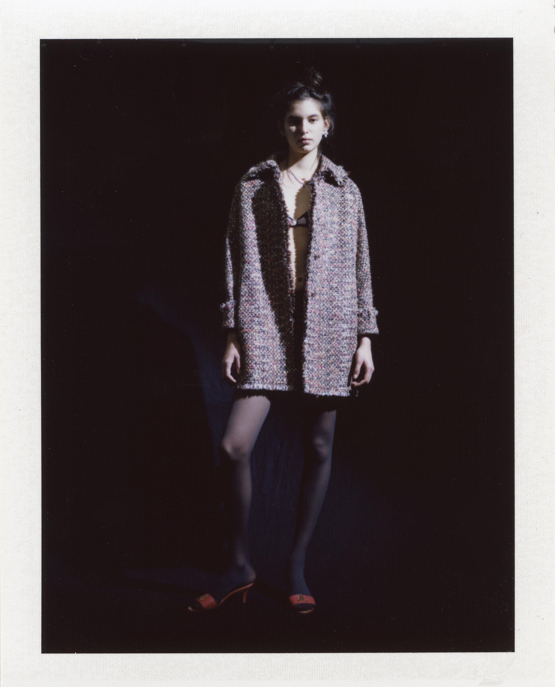
LURVE ISSUE 11 - MIGRATING
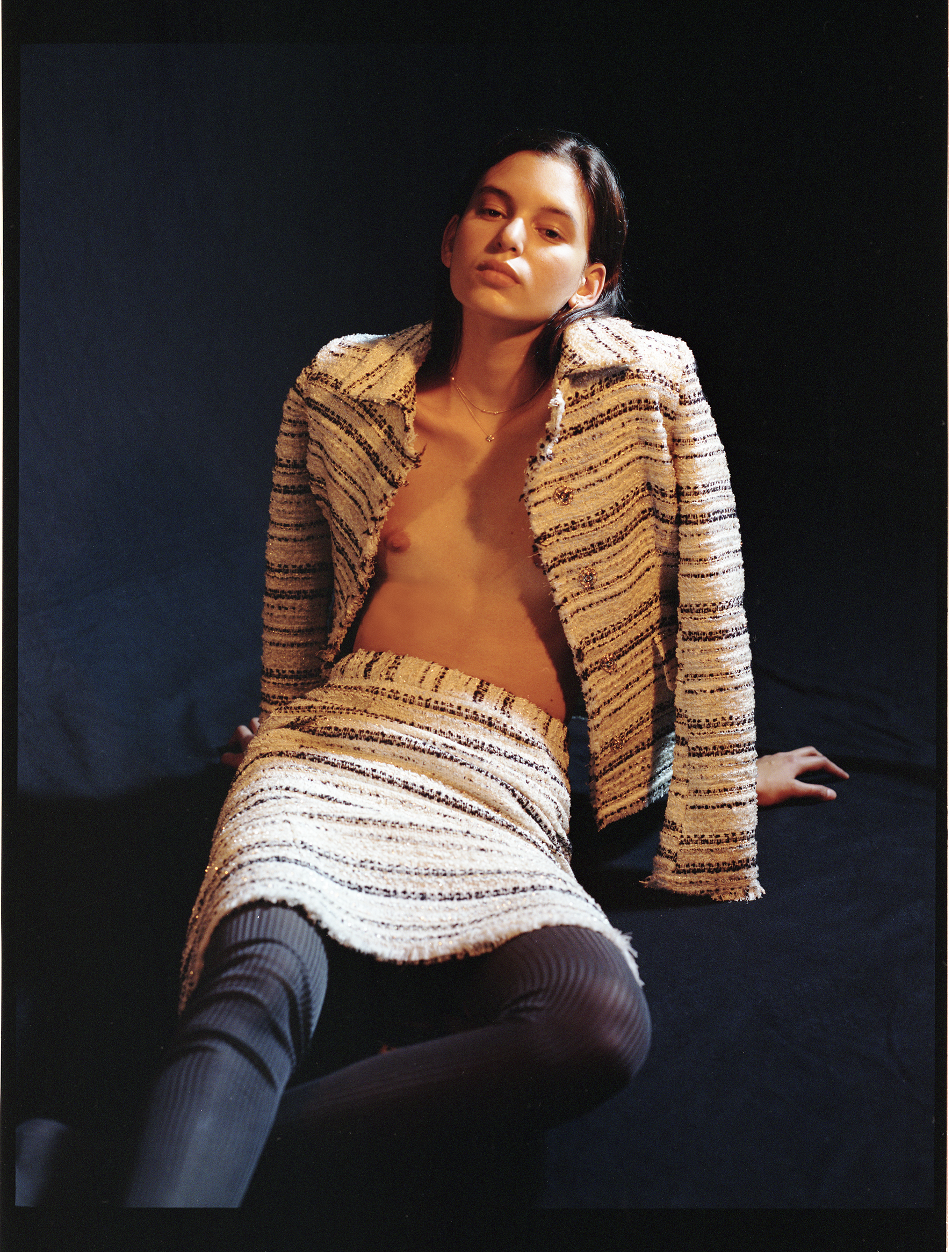
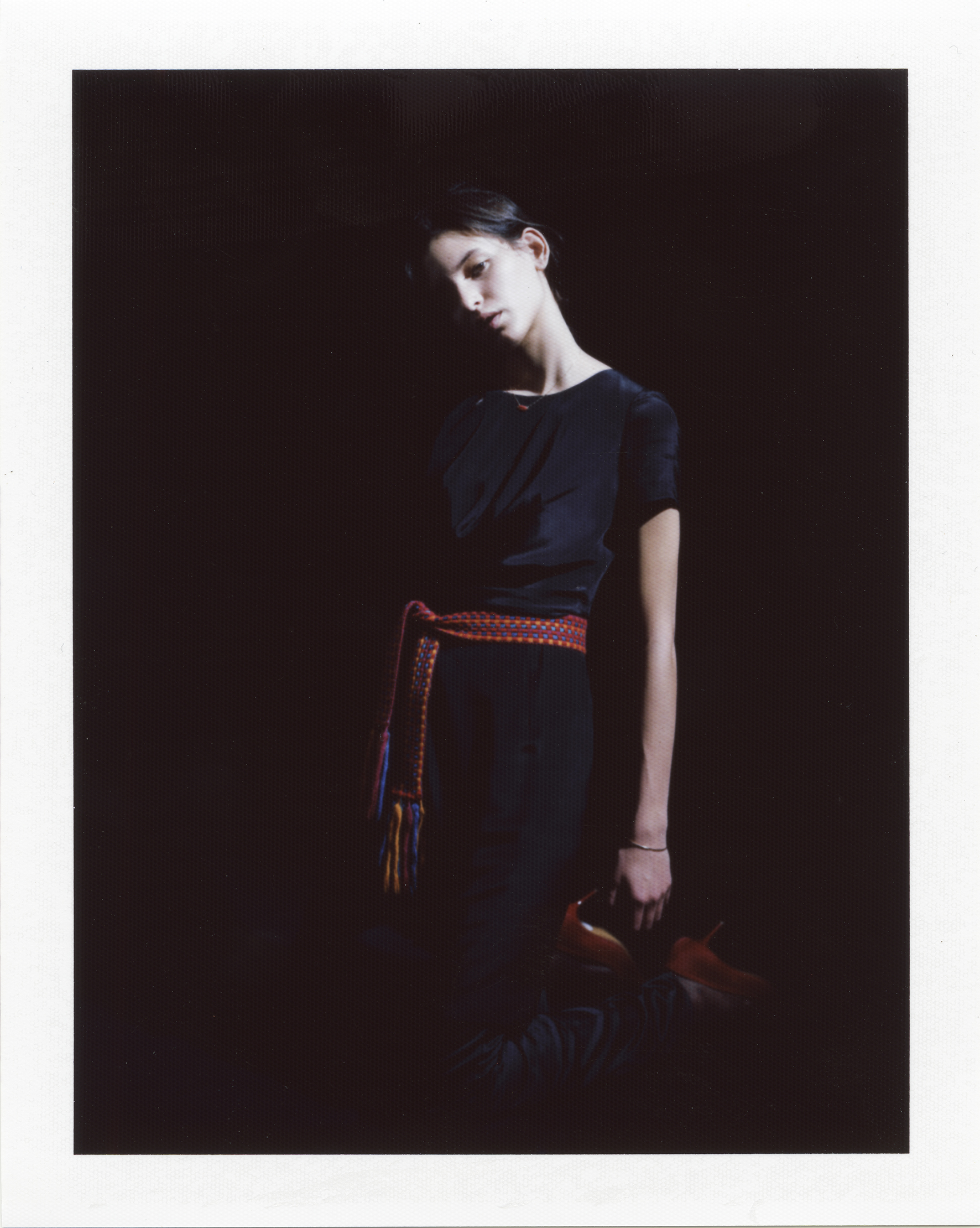
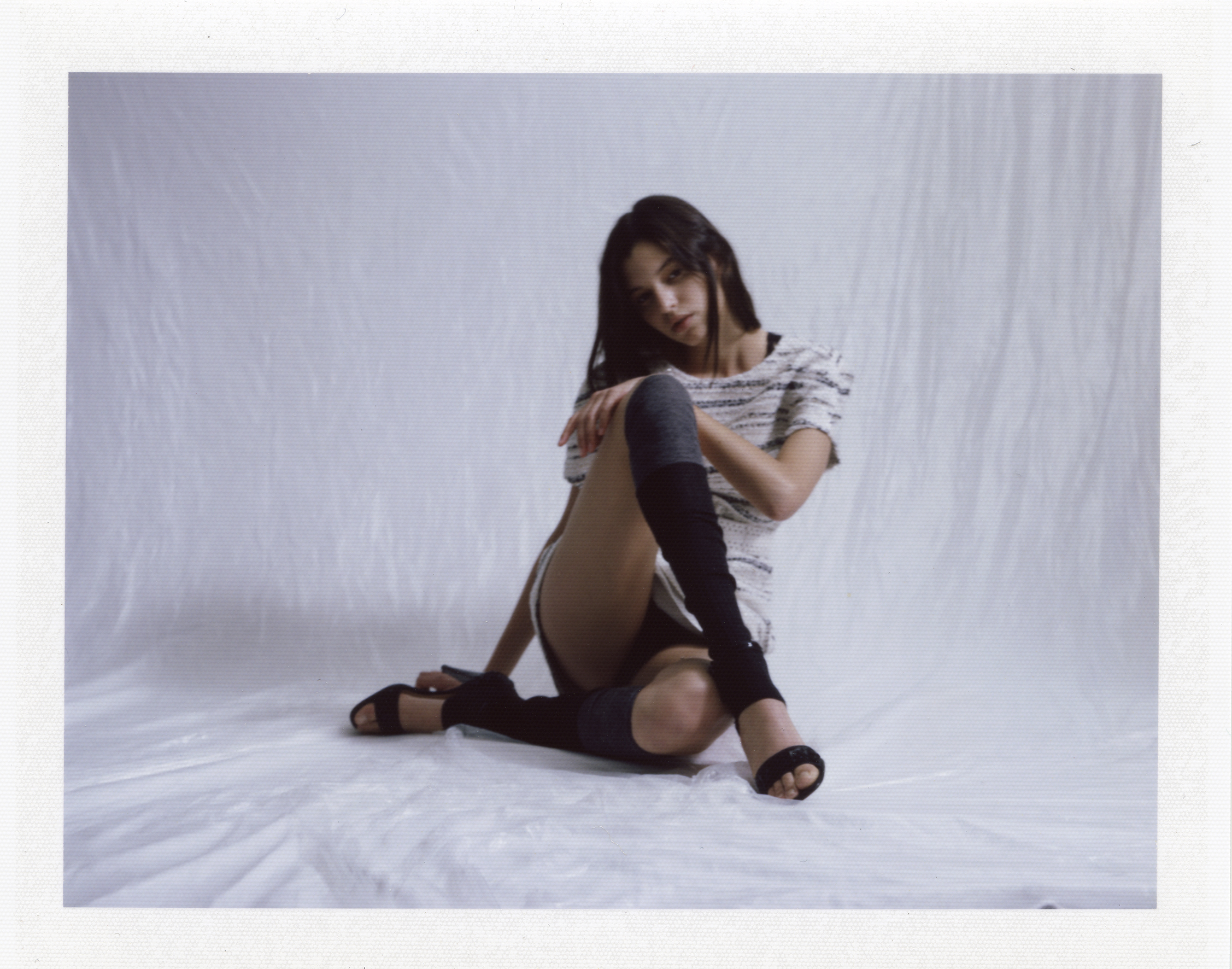
1981
PHOTOGRAPHY BY RICCARDO MERONI
STYLING BY FRANCESCA CISANI
interview by carlotta buosi

Carlotta Buosi speaks to Nana K. Brenu
Nana K. Brenu’s first exposure to the world of fashion was in New York, city which first helped him express himself creatively, without boundaries. The Ghanian designer – whose inspiration is a combination of symbols containing words of wisdom and vibrant modernity – is now based in Milan, where he cultivates his aesthetic and his brand, 1981. Milan is also where Nana has found the perfect balance between tradition and modernity, which allows him to take elements of his culture – especially the way in which fashion has an important social function in some African villages – and showcase a whole new Ghanian design, which is much more than loud prints and colours. Constantly challenged by the juxtaposition of these two ideas and the aim of merging them seamlessly, through this contrast Nana keeps opening new doors to his design. Doors he’s never sure where they’ll lead, but which never fail to surprise him.
Nana, you’re originally from Ghana, whose fashion is characterised by colours and prints. How much of your background and heritage influences your design, today?
I tend to look beyond the colours and prints when drawing inspiration from my background and heritage. I am more inspired by the culture, tradition and local craftsmanship. For example, every season I work with a group of local artisans who dye fabrics using the traditional batik technique. We use this process to create prints which look modern and contemporary.
Symbols – especially the ones associated with the tradition of your country-play a significant role in your design. Tell us more about them and about how you incorporate them in your style.
Adinkra symbols are visual symbols usually used as print designs on fabrics. They have messages which convey local traditional wisdom.I’m drawn to the graphic and monochromatic design which feels very modern to me, almost an exact opposite of the loud colourful prints we are known for. That’s why the prints I design are more of a graphic and geometric nature.
Why 1981?
When I started thinking about creating my own brand, I felt it was important to pick something that was significant to me. I was born in 1981 and I liked the idea of using numbers as I think they can be quite cryptic. Initially I had wanted to use my name, but then I decided I wanted the brand to have its own entity, not necessarily associated with me.
Going back to the contrasting influences which characterise your brand, you’re also inspired by minimalism and monochromatic design. How do you manage to convey these elements with your other influences?
My design aesthetic is contemporary, so it is easy for me to combine these elements with my other influences as it helps guides me to take an idea, strip it down to its bare element and develop it into something that feels relevant today.
How would you describe the final result?
A modern and contemporary reinterpretation in a state of harmony.
Do you think that – despite the contrasting tension generated by the merging of that with boldness – minimalism somehow allows you to create a balance in your design?
It does, in the sense that It helps question where an idea or design has a functional purpose or it’s merely decorative. Once an idea or theme is stripped to its bare essential its easier to find an harmonious way to combine it with a contrasting theme or idea. Apart from trying to create a balance in my design, I am constantly trying to reinterpret an idea, inspi- ration or theme in a more modern context.
Is balance something you aim to achieve or instead something you fear?
I think life is a balancing act because you have so many things going on at once, so balancing is something I relish since I enjoy the challenge. I see design as a balancing act too, as you have to combine the right fabric with the right colour to the right silhouette so that ev- erything is in harmony.
How important are trends in your opinion?
Trends are somewhat important because they help you gauge in which direction the market and fashion world is heading to. They help anticipate what buyers want and if you are able to capitalise on it, it can lead to success. However, following trends is a two-edged sword, since they come and go and don’t last forever.
Would you say you follow them or you’d rather focus on establishing your own, very personal aesthetic?
I look at trends to acknowledge what’s happening in the market but I don’t follow them in general. I feel it’s more important to develop a language and aesthetic that would make my brand unique. One should be flexible enough to be able to adapt to changes in the market and take advantage of trends, without losing his identity.
You’ve worked both in NYC and in Milan, where you’re currently based. How does these two cities differ and how have they both inspired you?
New York and Milan differ in the sense that New York has this energy that I can’t put into words: alive, pulsating and always evolving. Milan, on the other hand, is slow paced and – though not as historically beautiful as Rome or Venice – has this charm to it, which represents the modern Italian style.
Who is the 1981 girl and where is she going?
The 1981 girl is a modern woman who sees life as an adventure and a journey of personal discovery. She’s always on the move, trying to discover more of the world around her just as much as who she is.
model: Larissa Schumacher at Elite
hair: Valentino Perini using Bumble & Bumble
make up: Alessia Stefano using Aveda
photography assistant: Giuseppe Cicala styling assistant: Vittoria De Carlo
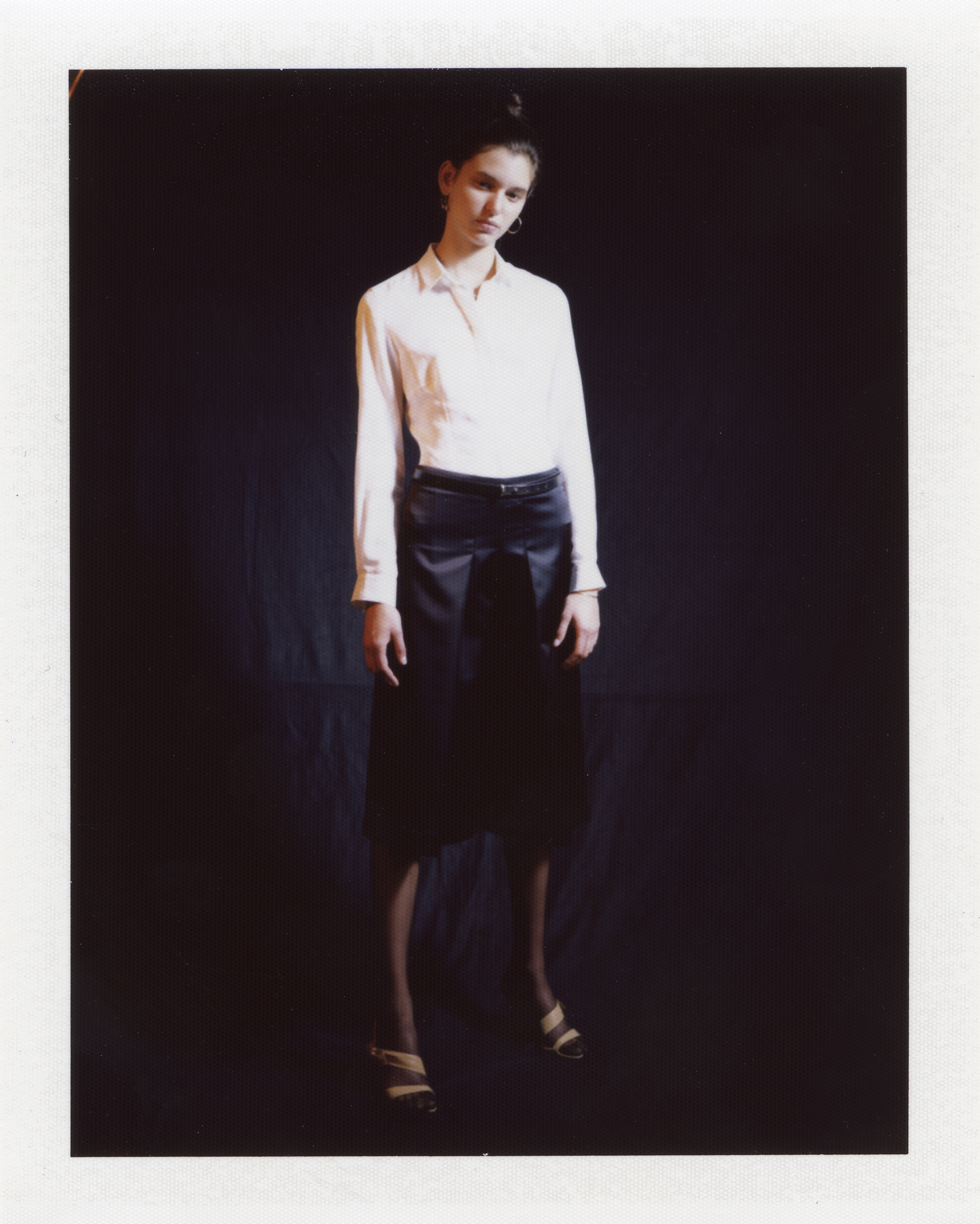
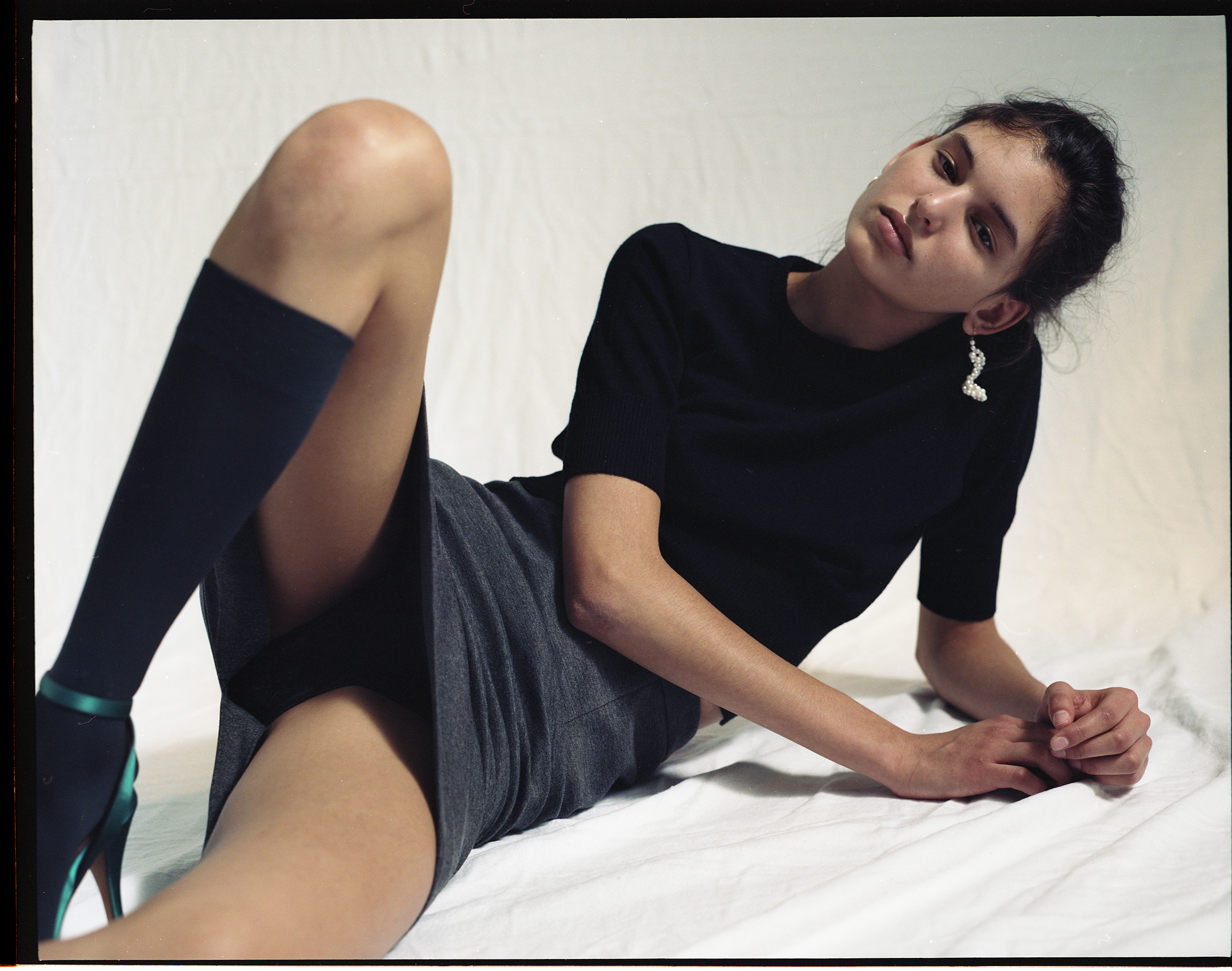
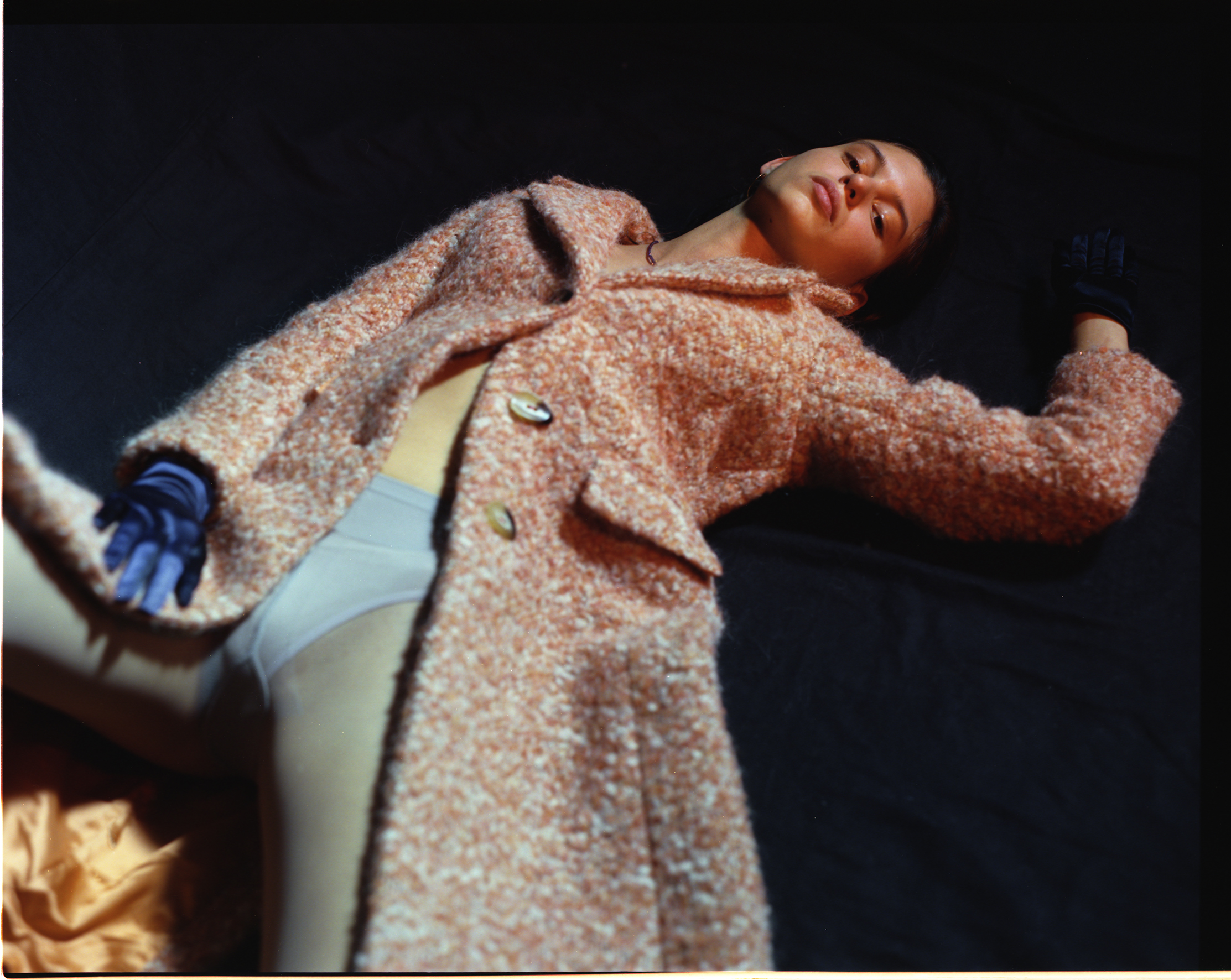
All clothing by 1981